Data Analysis
The collected sensor data was analyzed in Jupyter notebooks as part of the original university project. The analysis uses Plotly for interactive graphs and covers several techniques.
The full notebooks are in the air-quality-data-analysis repository.
Note
Some of the static plot exports below look cramped - the original Plotly graphs were interactive and looked better at full size in the notebook. The subplot titles and axis labels overlap in a few of the PNG renders. The data itself is fine, it's a rendering issue from exporting interactive plots to static images.
Dataset
About two weeks of continuous readings (~284,000 data points) from:
- BMP180 - altitude, pressure, sea-level pressure
- MQ135 - acetone, alcohol, CO, CO2, NH4, toluene
- DS18B20 - temperature
- DHT22 - humidity
Data was collected at roughly 1-second intervals via the daemon and stored in InfluxDB. The sensor was placed indoors, which is why the readings are quite stable - temperature stays around 24-25C, humidity around 48%, pressure around 999 hPa.
Analysis techniques
The main analysis notebook covers:
Heatmaps
Temporal distribution of temperature, humidity, pressure, and CO2. Midnight boundaries are marked to show daily patterns.
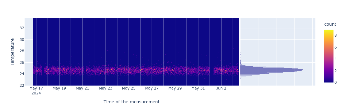
The temperature heatmap shows the readings are tightly clustered around 24-25C with very little daily variation. This makes sense for a climate-controlled indoor environment. The gap around Jun 1 is a data collection interruption (likely the device was restarted or lost WiFi).
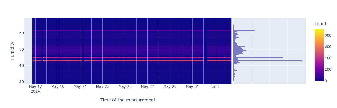
Humidity shows more spread (roughly 42-52%) and some visible banding - likely from daily patterns like cooking, opening windows, etc.
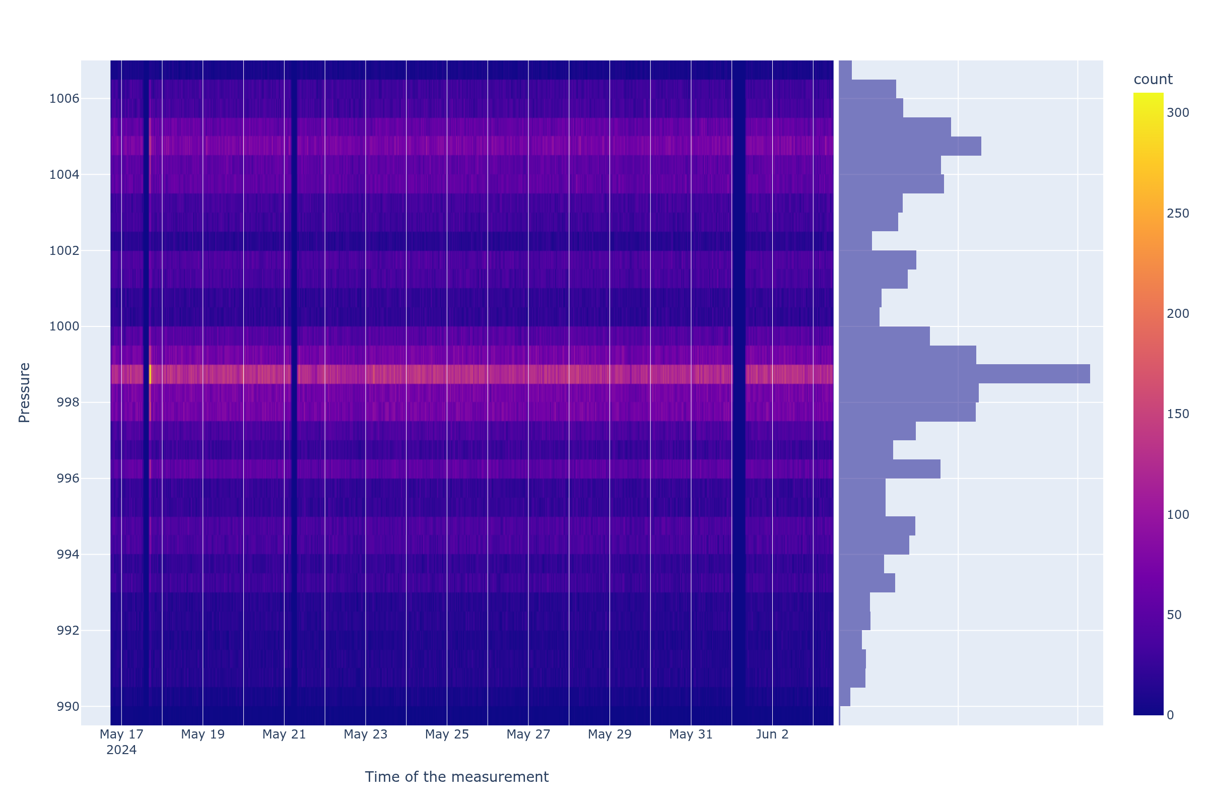
Pressure has the most natural variation (990-1006 hPa) and shows clear weather-driven patterns. This is the one parameter where outdoor conditions are directly visible even indoors.
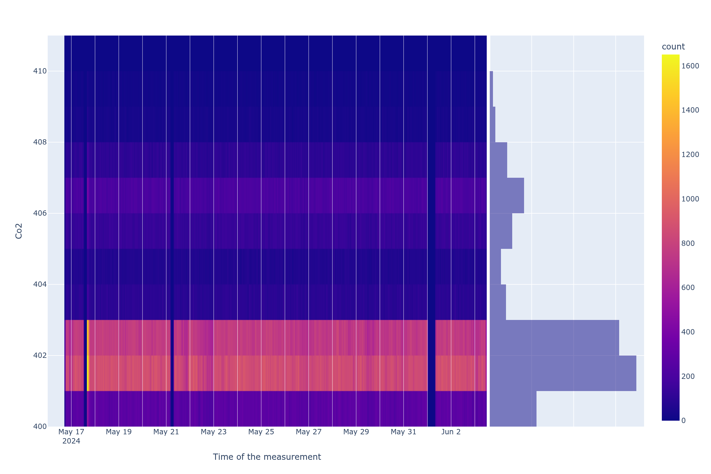
The CO2 heatmap is worth taking with a grain of salt. The MQ135 is a cheap gas sensor not really designed for precise CO2 measurement - it's more of a general air quality indicator. The readings cluster tightly around 400-403 ppm, which is close to ambient outdoor CO2 levels, suggesting the sensor mostly reads baseline. The few higher readings (405-410) could be real spikes or just sensor noise.
Histograms
Distribution of key environmental parameters.
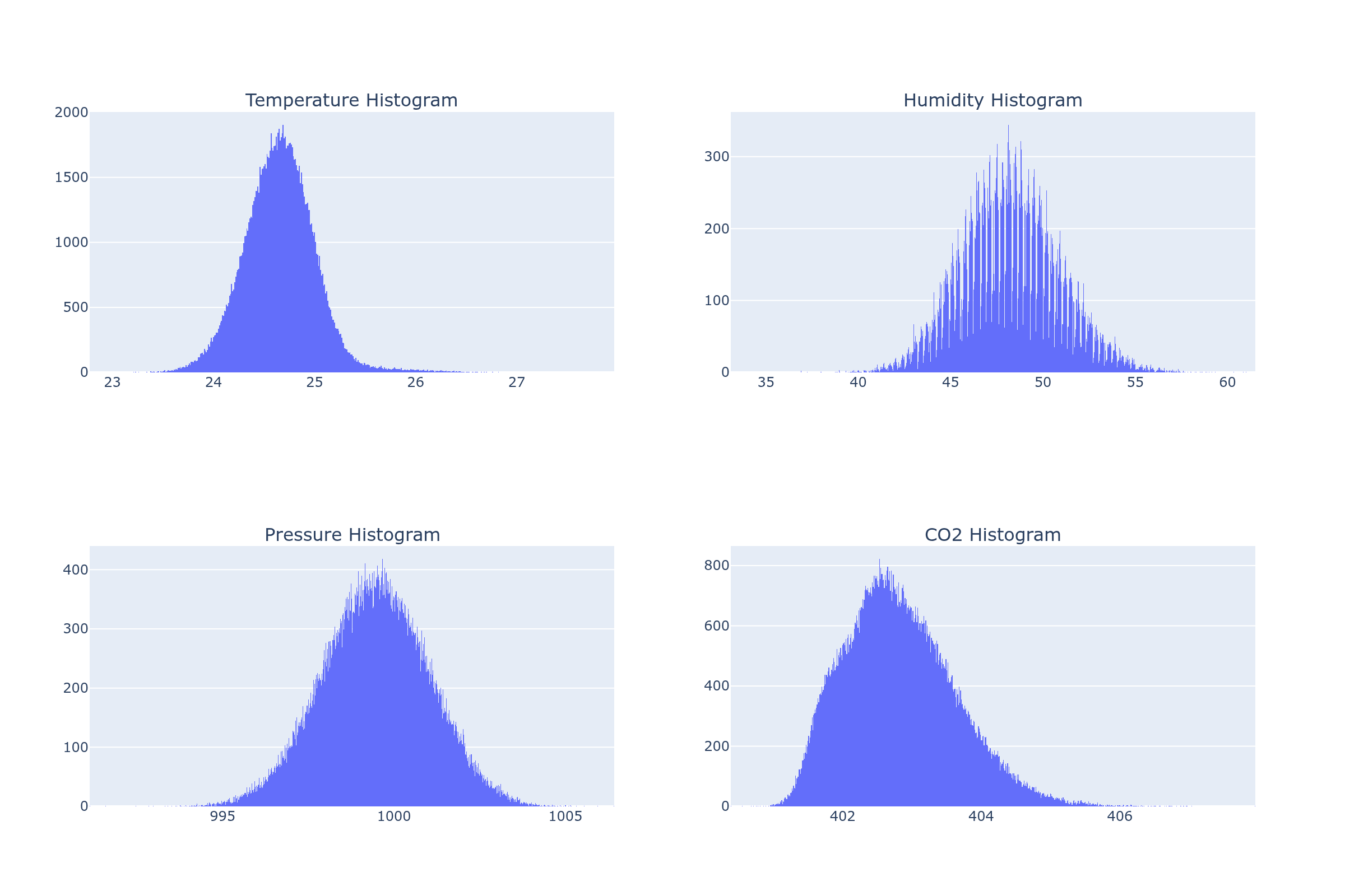
Temperature and pressure show roughly normal distributions. The humidity histogram has a spiky appearance - the DHT22 sensor reports humidity in discrete steps rather than smooth continuous values, which creates the comb pattern. The CO2 histogram again shows the tight clustering around 402-403 ppm.
Correlation matrix
Relationships between temperature, humidity, and pressure.
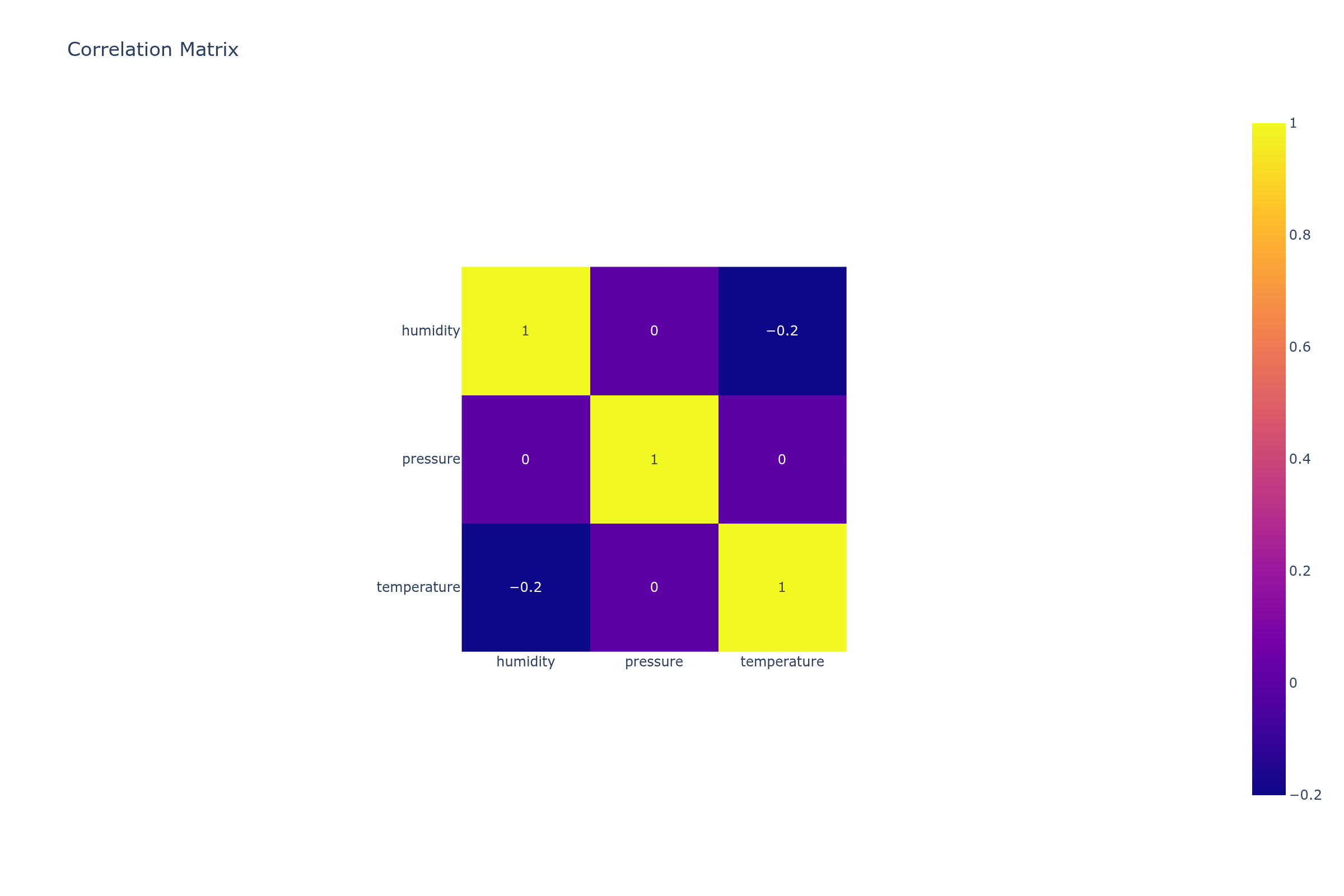
Almost no correlation between any of the parameters (-0.2 to 0). This is expected for a controlled indoor environment over just two weeks - the variables are all relatively stable and don't have enough variation to show meaningful relationships. A longer collection period or outdoor placement would likely show stronger correlations (e.g., temperature and humidity tend to be inversely correlated outdoors).
Scatter plots with regression
Pressure vs humidity and pressure vs temperature, with linear regression trendlines.
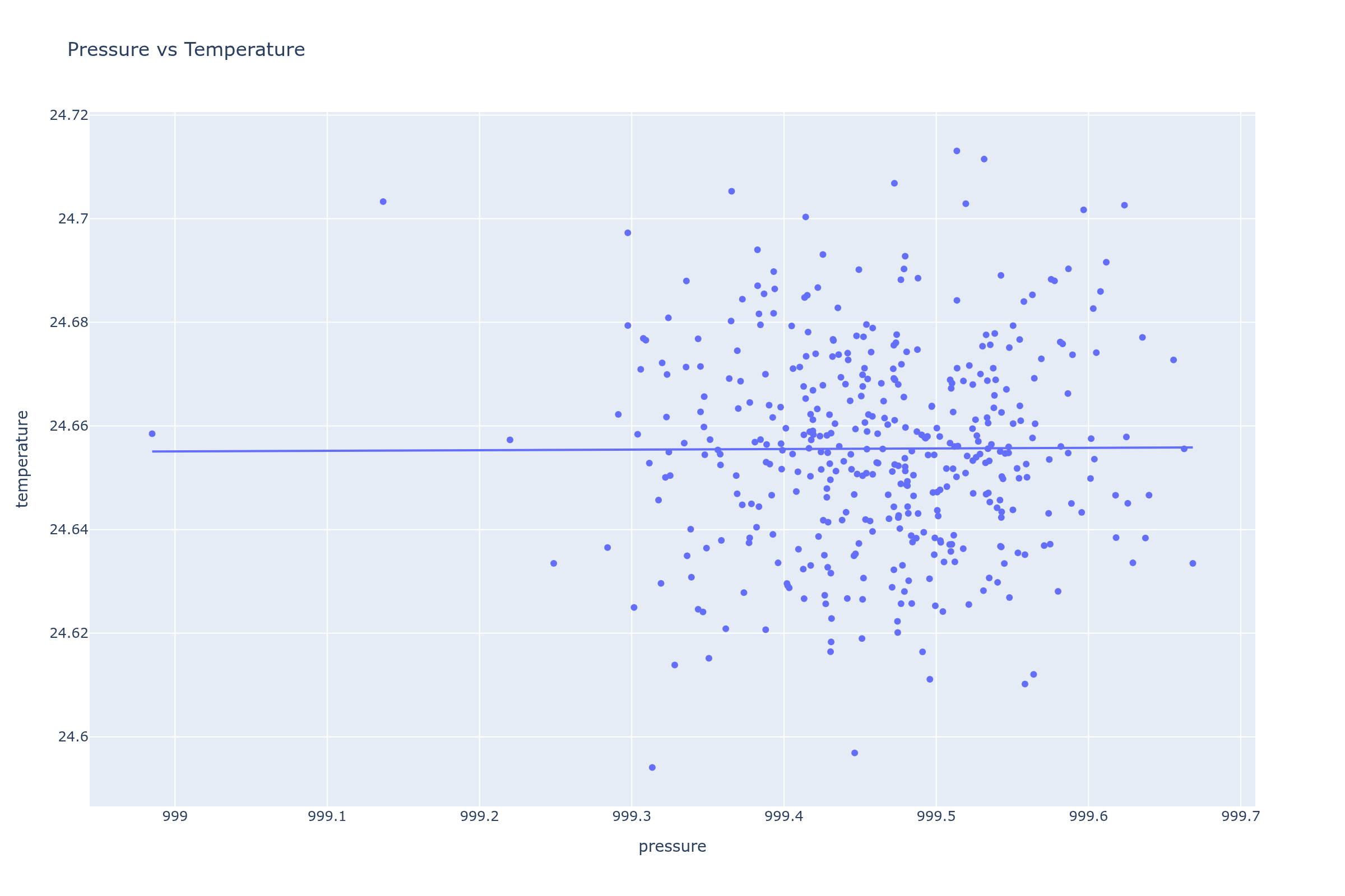
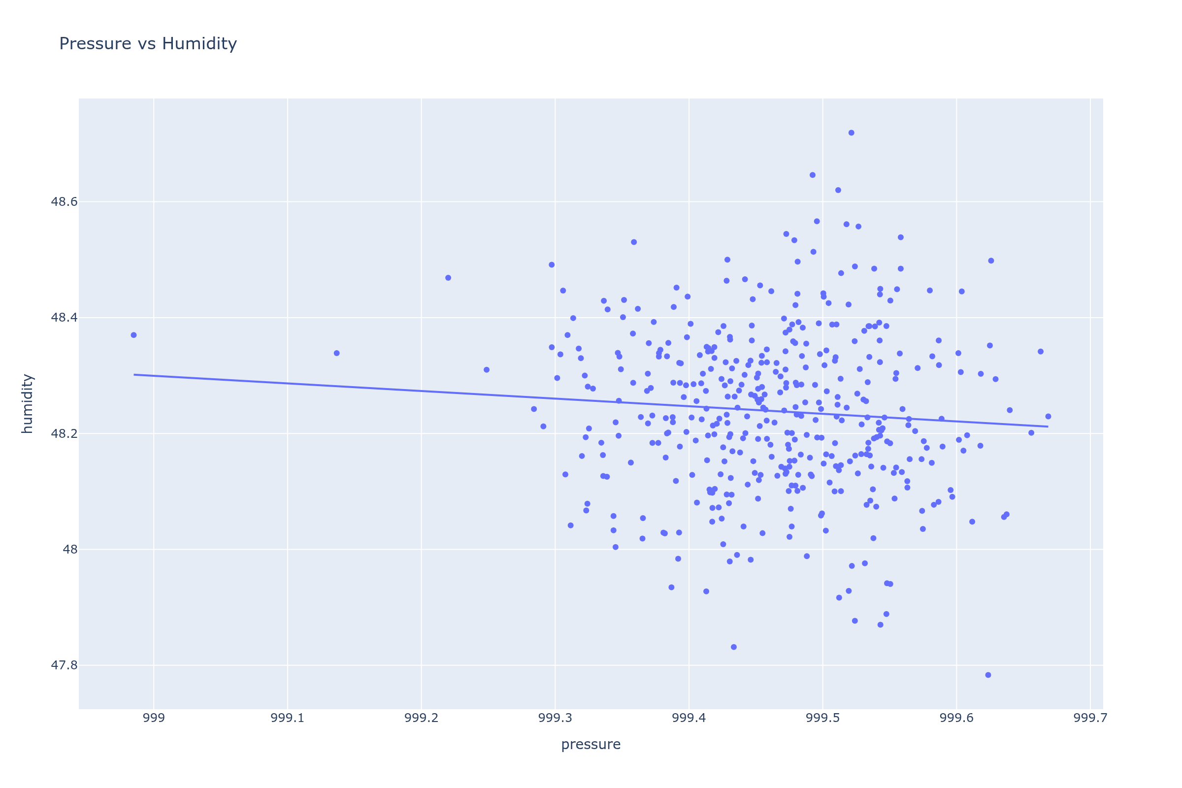
The scatter plots confirm what the correlation matrix shows - no meaningful linear relationship between these parameters in this dataset. The data forms tight clusters rather than trends.
Time series with rolling means
Temperature, humidity, and pressure over time with 24-hour rolling averages to smooth out noise.
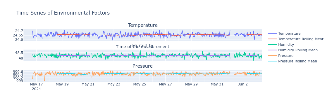
The subplot layout is a bit cramped in the static export (titles overlap axis labels). In the original interactive notebook these look much better. The rolling means (24-hour window) smooth out the short-term noise and show that all three parameters are fairly stable over the two-week period.
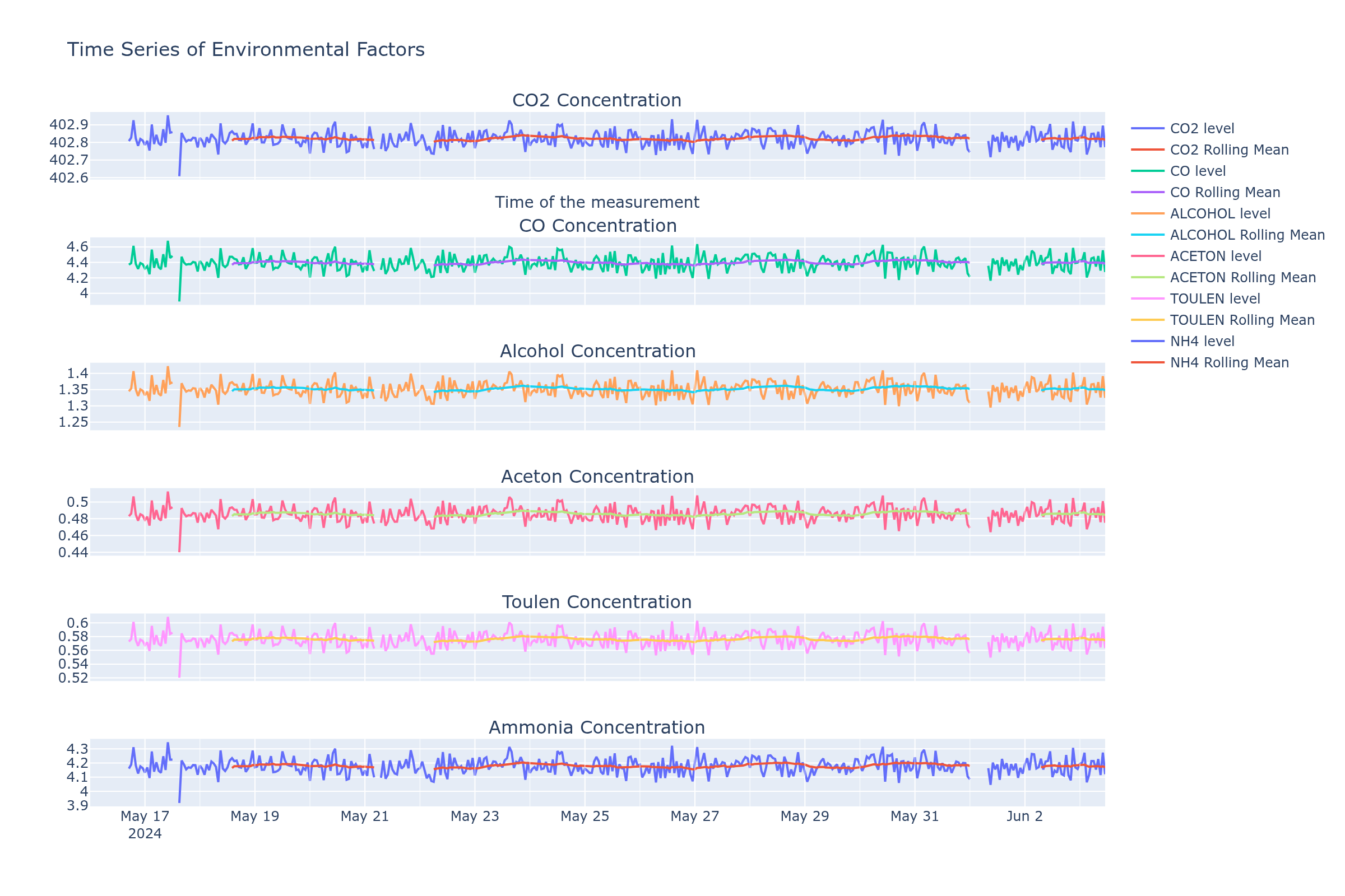
Gas concentrations
CO2, CO, alcohol, acetone, toluene, and NH4 readings over time with rolling means.
All MQ135 readings are nearly flat lines. This is a known limitation of the MQ135 - it needs proper calibration in a controlled environment (clean air baseline) and even then its readings for individual gases are approximate at best. The sensor datasheet recommends it for detecting significant air quality changes (like smoke or gas leaks), not for precision measurement of specific gases at low concentrations.
What could improve this:
- Calibrate in a known clean-air environment before deployment
- Use dedicated sensors for specific gases (e.g., NDIR sensor for CO2)
- Collect data over a longer period to capture more variation
- Place the sensor in a less controlled environment (e.g., near a kitchen or window) where there are actual air quality events
Anomaly detection
Z-score based outlier detection (threshold: 3 standard deviations) across all parameters.
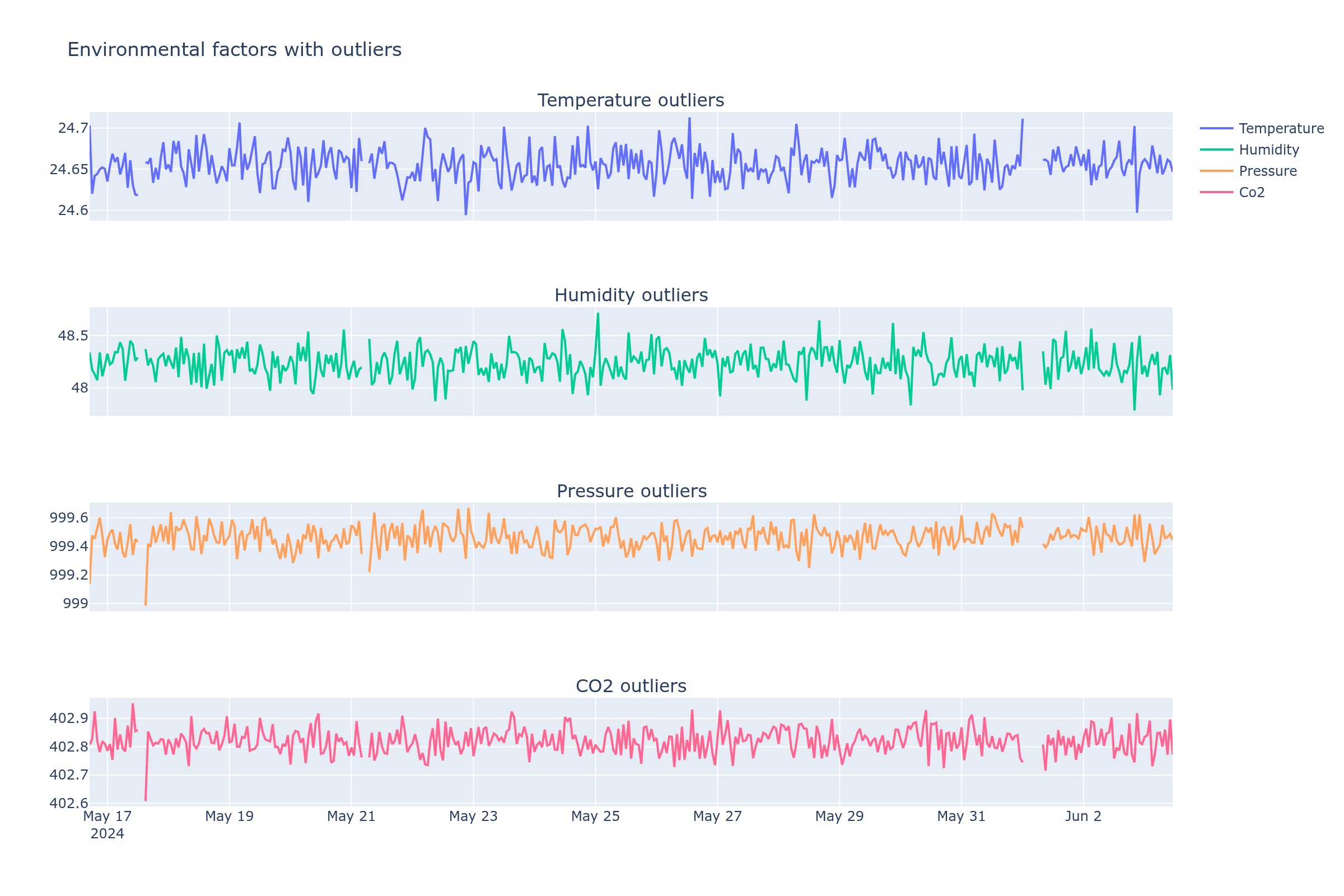
With such stable indoor data, very few points exceed 3 standard deviations. The detected outliers are mostly sensor noise rather than real environmental events. A more useful approach for this dataset might be a lower threshold or a different method (e.g., isolation forest, or change-point detection for the data collection gaps).
Seasonal decomposition
STL (Seasonal and Trend decomposition using Loess) for temperature, humidity, pressure, and CO2 - showing trend, seasonal, and residual components.
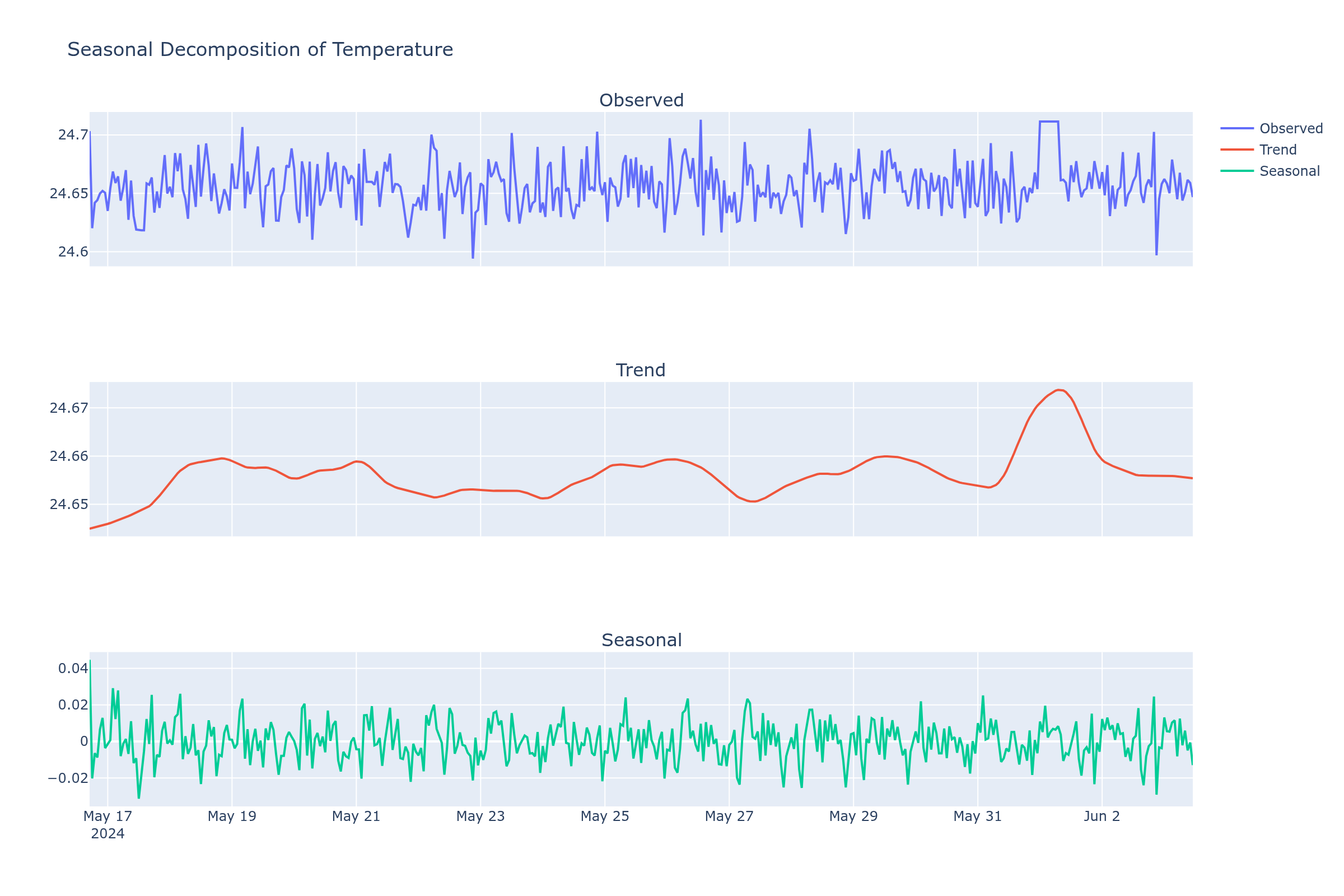
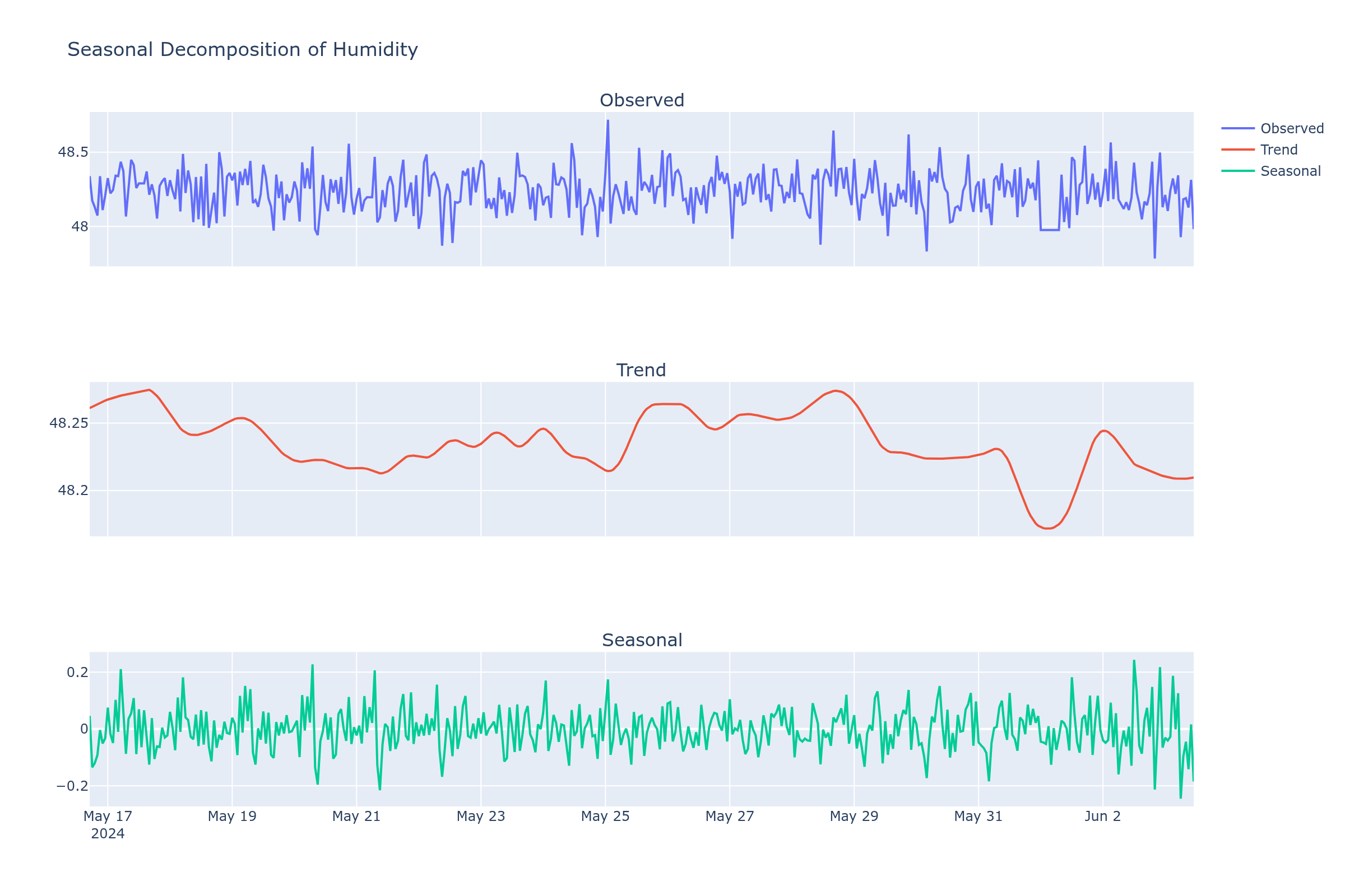
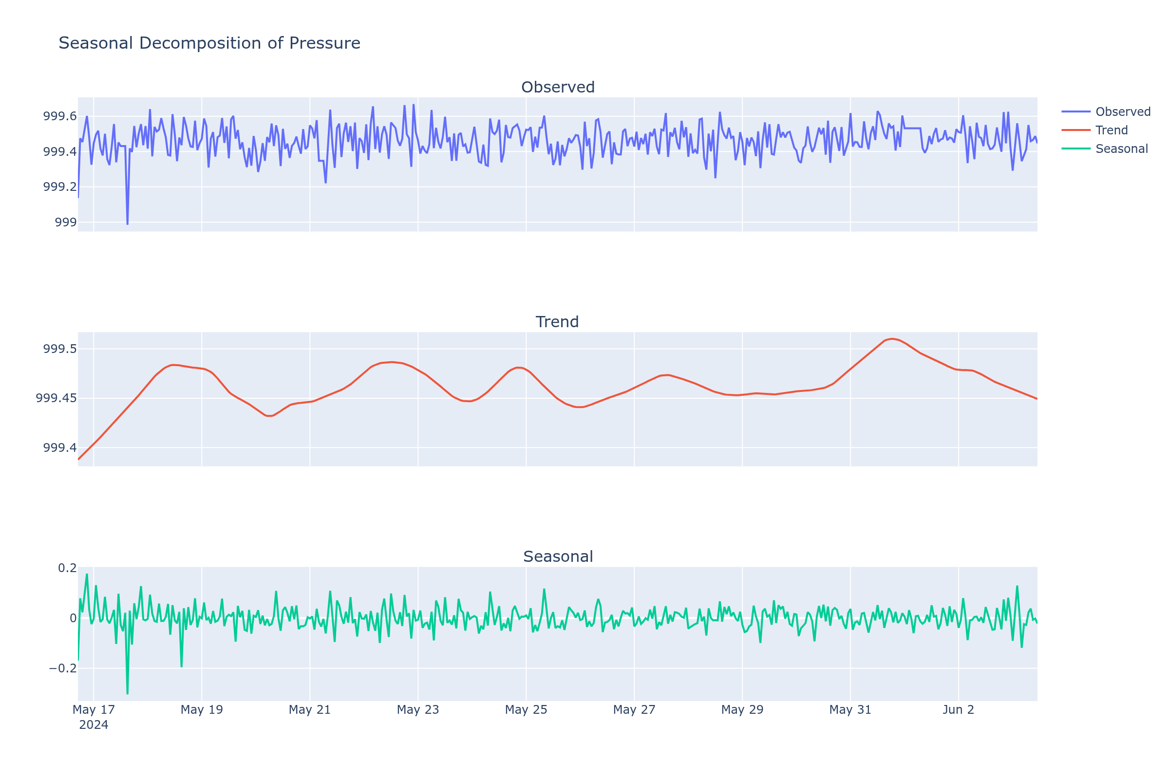
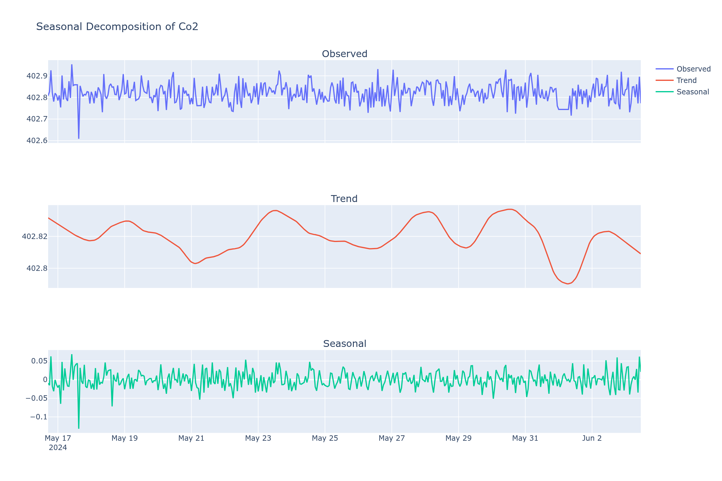
The decomposition works best for pressure, where there's a visible trend component reflecting weather changes. Temperature and humidity show very weak seasonal (daily) components - again, the indoor environment dampens natural daily cycles. CO2 decomposition is mostly noise given the sensor limitations.
What would actually improve the analysis
- Longer collection period - two weeks is too short for seasonal patterns. A few months would show weather-driven trends in pressure and temperature, and seasonal humidity changes.
- Better CO2 sensor - replace MQ135 with an NDIR CO2 sensor (like SCD30 or MH-Z19) for accurate readings.
- Outdoor or semi-outdoor placement - the controlled indoor environment produces very stable readings with little to analyze. Near a window or in a room with varying occupancy would give more interesting data.
- Higher-quality resampling - the 5-second resampling for heatmaps and 10-second for histograms was chosen somewhat arbitrarily. The raw 1-second data is noisy, but the choice of resampling interval affects what patterns are visible.
- Multiple sensor locations - comparing readings from different rooms or indoor vs outdoor would make the correlation analysis more meaningful.
For time-series forecasting, see Forecasting.